
Creative Direction, Art Direction, Design, Brand Strategy, Creative Strategy, Brand Identity, User Experience, Website Design, Marketing, Illustration, Motion Graphics, Presentations, Brand Management
Creating a unique, yet related, look and feel for three of Personify’s product brands that align with their Corporate identity.

The Label Collective worked with Personify to create distinct brand visuals for their products while maintaining a cohesive corporate identity.
End Results
By the end of the project, Personify’s products featured distinct visual identities and asset libraries for their target audiences while maintaining ties to the corporate brand through icons, a purple color scheme, and the loop element. Style guides and brand systems were created in Figma to ensure consistent branding across Marketing, Development, and Product teams.
MemberClicks
MemberClicks was the first product to receive a brand update. Personify’s goal was to reflect what clients love and value about MemberClicks and preserve its brand equity, all while ensuring the brand kept its whimsical, friendly, relatable, and easy-to-use perception. New fonts that fit the product’s persona were chosen, colors were adapted, and parts of the Personify corporate brand were placed in illustrations for a visual tie-in. Illustrations of the product’s UI and functionality were paired with images of people representing the members using the software.


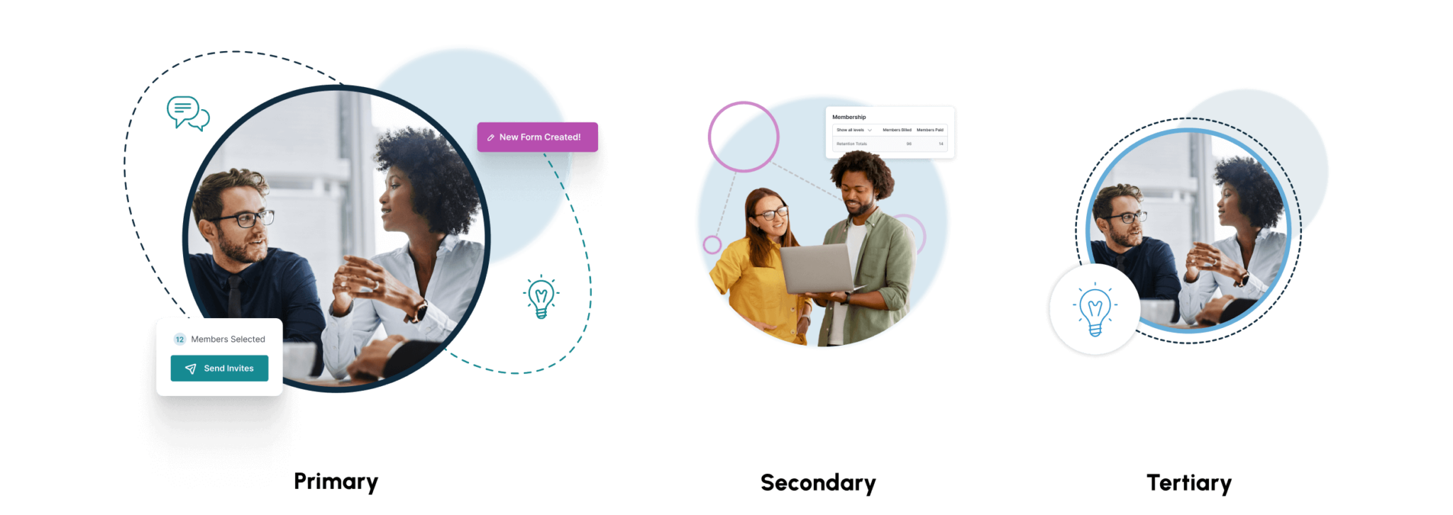
UI SNIPPETS
When a user doesn’t need to see the entire interaction, visuals are condensed into “snippets” that highlight key action areas within the broader user interface.


A2Z Events
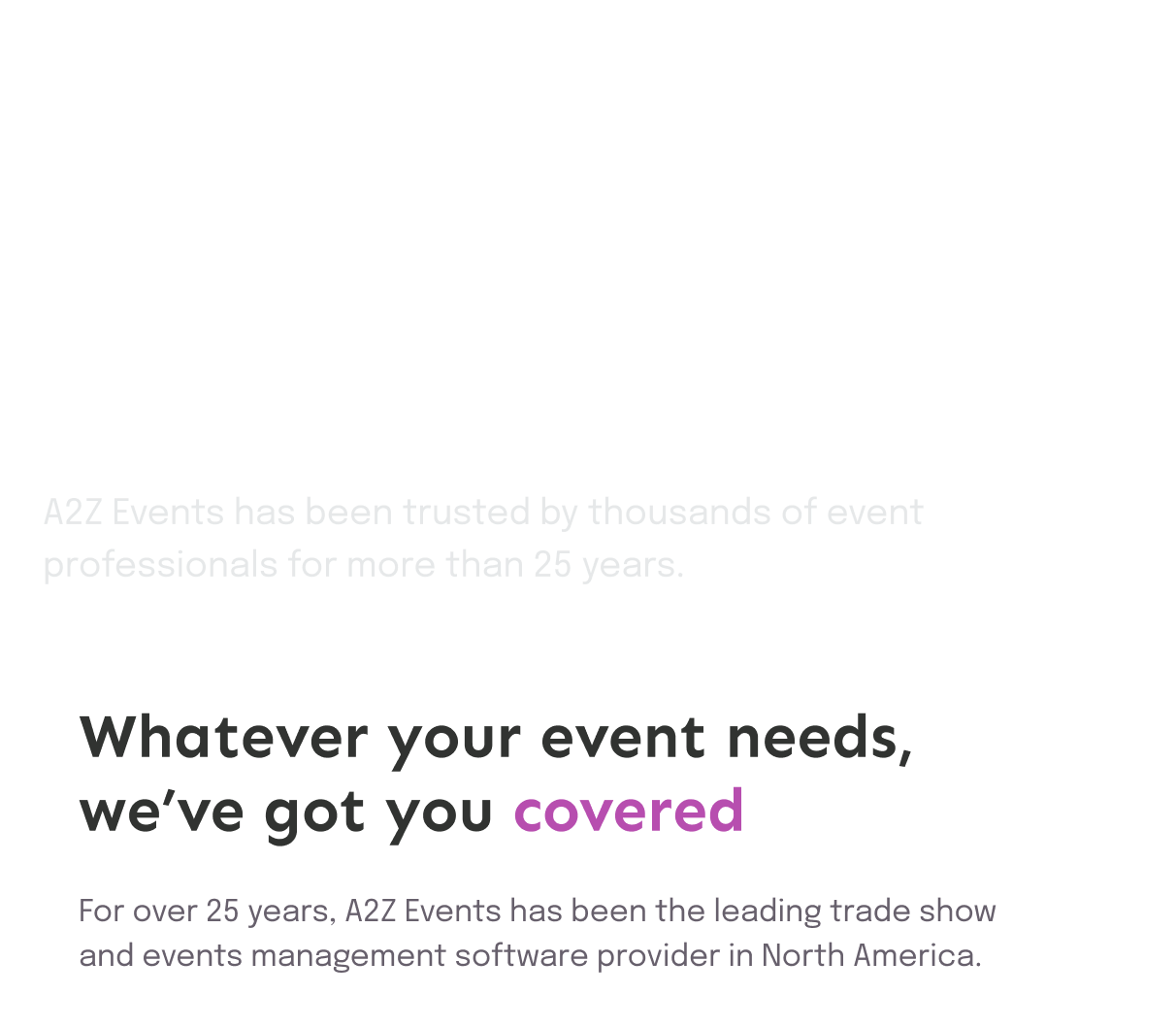
A2Z Events was the second product to undergo a brand update. A2Z Events’s rebrand was key to bringing acquired products and features under one name, creating an opportunity to highlight and represent their (now) end-to-end events platform. Large conference and tradeshow floorplans informed the grid system used in the new visuals, which were meant to capture the journey through events management for their larger, more enterprise-level audience. New fonts were chosen, and darker colors were introduced into the color palette. Screens were also illustrated to draw attention to the product’s simplicity.


Introducing the Floorplan Grid
This visual system is inspired by event and trade show floor plans. “Booths” or “rooms” are flexible within the space, and shapes are composed of 1 to 4 grid spaces in a vertical or horizontal direction. Dashed lines represent the pathways of attendees as they navigate the event.

Since the website refresh, the Personify A2Z Events website accomplished:
357.9%
increase in sessions
49%
decrease in site bounces
16.3%
increase in average session duration
415.4%
more conversions
Extension into Product UI Branding
Once the brand launched, the Product team loved the new styling enough to adopt the UI and extend it into the A2Z Events Product Design System.


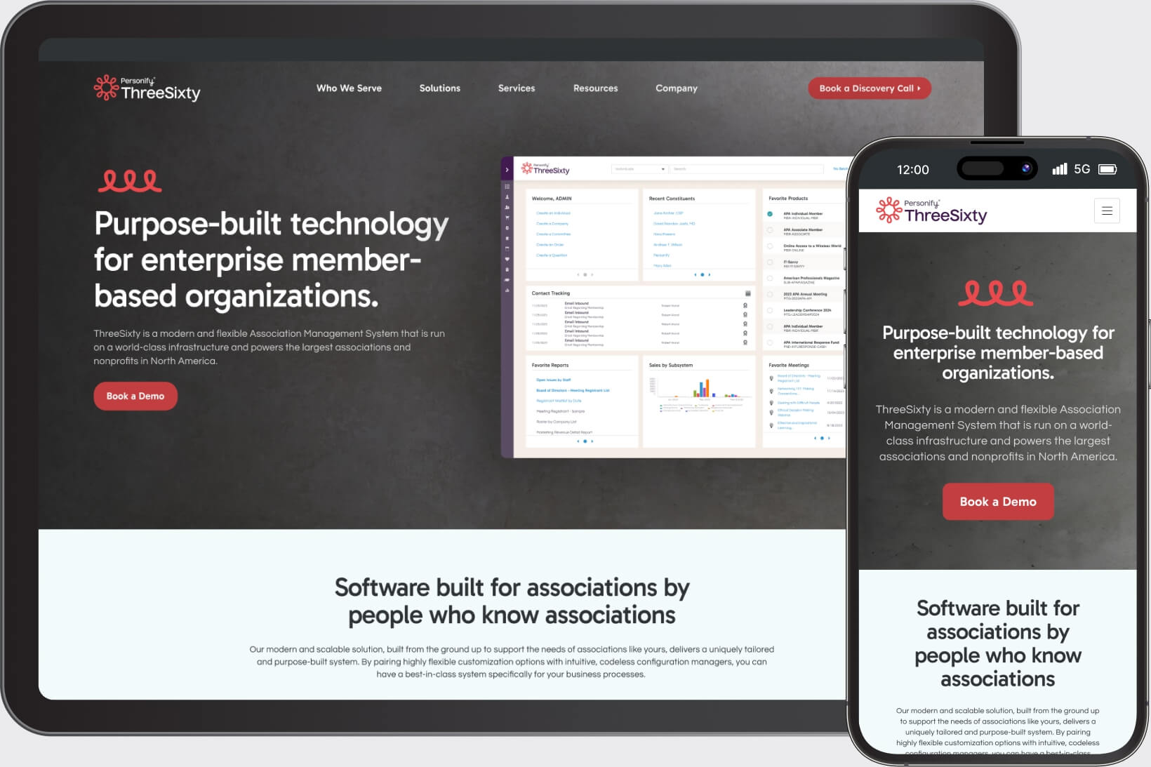
ThreeSixty
ThreeSixty was the third product brand refresh. ThreeSixty is Personify’s legacy, top-tier Association Management System (AMS) in their portfolio, and the new brand needed to reflect a more premium product. New fonts were introduced, the color palette was toned down relative to other brands in Personify’s product suite, and lifestyle photography was brought to the forefront. Illustrated elements were used less frequently to avoid looking too playful to their IT, Enterprise-level audience. Product UIs were also illustrated to directly demonstrate the software’s robust capabilities.


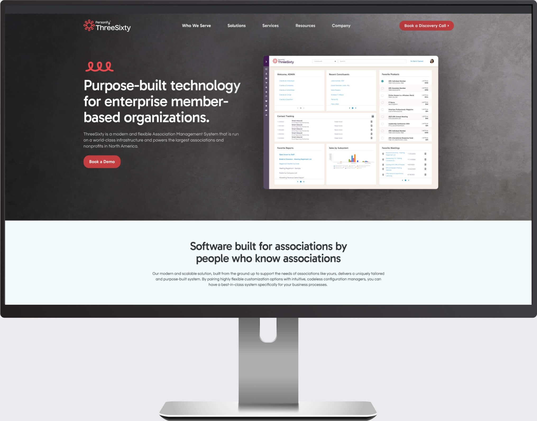
To enhance the minimal design of the ThreeSixty brand, textures were added to the background, providing depth to large areas and photos.


